Fluffy Chicks Practice Yoga Poses in Realistic Oil Paintings

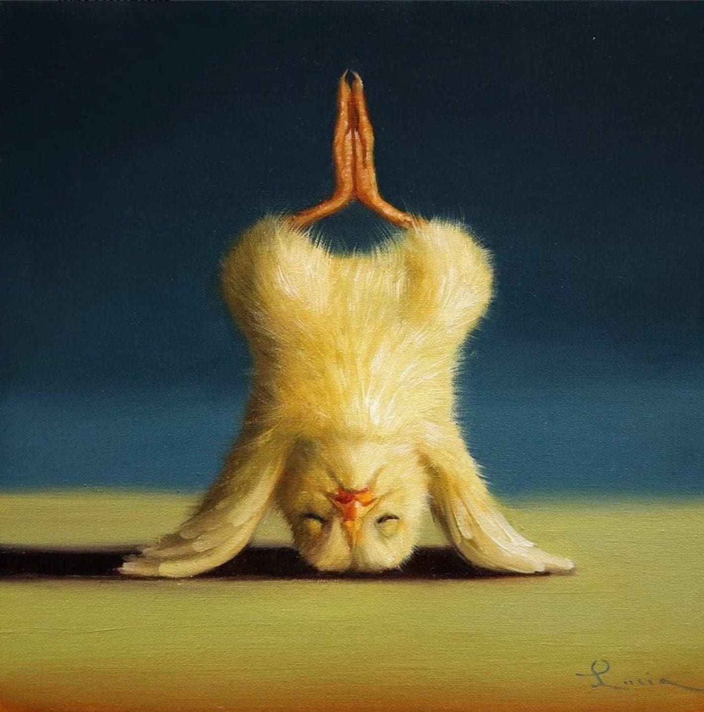
People practice yoga with animals all the time in real life, but it is only in the tenderly painted worlds of Lucia Heffernan that you can see a yellow chick folding into a successful triangle pose. The graphic designer and oil painter captures baby birds stretching into a variety of poses in her series of Yoga Chick paintings.

Heffernan creates these delightfully humorous situations by using her realistic style to depict unrealistic scenarios. Each bird is placed against a stage-like backdrop of blue and yellow, which emphasizes the action of the subject. The juxtaposition of a carefully rendered chick as it stands on its head is what makes these tiny portraits so enjoyable to look at. “Through my paintings, I seek to give animals a voice and a personality, while making light of our uniquely human existence,” Heffernan explains on her website.

Read the full article here…

500 Years of Drawing the Human Body

OG Abel (Abel Izaguirre), “Love & Hate” (August 19, 2012), graphite on paper in LA Liber Amicorum / Graffiti Black Book (Los Angeles, 2012), Getty Research Institute, Los Angeles. Gift of Ed and Brandy Sweeney. (© OG Abel, all images courtesy Getty Research Institute, Los Angeles unless otherwise stated)

Before Andreas Vesalius published his landmark title on human anatomy, The Fabric of the Human Body, in 1543, it was a commonly held belief that men had one less rib than women. (As the biblical story goes, God made Eve from Adam’s rib, so the math checked out, at least for the pious.) In De Fabrica, as the book is popularly known, the Renaissance physician dismissed the theory as “clearly ridiculous” and went on to literally and figuratively dissect the human body in one of the most ambitious and influential medical texts of his epoch. It was also among the most intricately illustrated, with 200 woodcut prints based on Vesalius’s anatomical drawings made by Jan Stephan van Calcar, an apprentice of Titian.

Read the full article here…

Street Artist Turns Entire City Into His Personal Canvas With Whimsical Chalk Drawings

While some artists like painting on canvases, others like David Zinn seek unexpected places to add art. The Ann Arbor artist creates whimsical chalk art on local sidewalks, brick walls, and more, oftentimes incorporating real-life elements (like cracks in the cement) into the illustration.

Zinn draws a range of quirky animal characters in his distinct, cartoon-like style. Each one is cleverly rendered to look as though it is interacting with the surrounding environment. His drawing of a green frog, for instance, utilizes a sprinkler head in the background as the shape of the amphibian’s right eye. Similarly, a small pink rabbit in a tutu walks across the division in the sidewalk as though it were a tightrope. Not only do these choices bring Zinn’s art to life, but they also infuse the real world with some of his enchanting imagination.

Read the full article here…

Luscious Oil Paintings Bloom Flowers That Look Real Enough To Touch

Flowers and art have had a long and storied relationship. From Monet’s Water Lillies to Van Gogh’s series of Sunflower paintings, artists have spent countless hours immortalizing the beauty of blooms. Buenos Aires-based artist Maria Marta Morelli continues the tradition of flower art with her series of large-scale paintings of peonies and roses.

“I’m very interested in the cycle of time and I consider myself an environmental painter, focused on Mother Nature’s beauty,” Morelli tells My Modern Met. “Flowers represent youth, sensuality, tenderness, splendor, passion, love, and beauty, but at the same time they also represent the unbearable finitude of life.” She renders her subjects with layers of oil paint until each tiny detail is captured. Furthermore, she places her flowers against a solid color background to enhance the vibrant splendor of the flora.

Read the full article here…

Intricate Cross-Hatching Layers Elena Limkina’s Exquisite Illustrations in Black Ink

Images © Elena Limkina

From her studio in Moscow, Elena Limkina (previously) illustrates pages upon pages of sketchbooks with delicate studies of birds, architectural flourishes, and surreal compositions that trap cats and small mice inside glass vessels. She’s spent a decade drawing these elegant compositions, and while they originally functioned as diaries filled with objects, phrases, and impressions she encountered throughout her day, they’ve evolved into narratives unto themselves with recurring characters and motifs.

Frequently working in watercolor, the artist uses solely black ink, pencil, or pen in her sketchbooks, and the meticulous illustrations are shaded with circular crosshatching.

Read the full article here…

Brenda Goodman’s Fearless Self-Portraits

Brenda Goodman, “Self-Portrait 4” (1994), oil on panel, 64 x 60 inches (all images © Brenda Goodman, courtesy Sikkema Jenkins & Co., New York)

Brenda Goodman has been defining a singular path in painting at least since 1973, when she had her first exhibition in Detroit. From the paintings done around this time, it is immediately evident that Goodman was uninterested in either aligning herself with any of the styles going on around her or in making polite, palatable views. That early testimony to her fearlessness — which is still going strong — is apparent in the eight works done between 1974 and 2006 in the exhibition Brenda Goodman: Self-Portraits at Sikkema Jenkins & Co. (January 11 – February 12, 2022). 

While I have seen these and related self-portraits numerous times, as well as previously written about Goodman’s pursuit of this subject, the unlikely combination of raw pathos and tenderness always stops me in my tracks. The other thing that brings me up short is Goodman’s preoccupation with the body in tandem with her audacious rejection of portraiture based on likeness and the face.

Read the full article here…

Guariento di Arpo relaxes perfection

Guariento di Arpo, Principati’s angels, ca. 1357

ictorial perfection ruled among artists in 13th century Padua. Mater perspectivae picturae, “the mother of painted perspective:” this is how the Euganean city was addressed. Crowds of scientists, opticians, builders, and artsy ladies who bore the Ancient names of Fina, Lieta, and Giliola gathered on the city’s squares, those corners now called “Duomo”, “Signori,” “delle Erbe,” and “della Frutta.” Padua was known to be a crossroad between art and science, a balance that the lords of the city, the Carraresi, strenuously protected. Great Aristotelian philosophers lived in Padua, first of all Pietro d’Abano, professor at the University, scholar of Islamic medicine, and friend of Marco Polo, but also Lovato Lovati, Albertino Mussato, Marsilio of Padua, Biagio Pelacani, and the Dondi dall’Orologio’s. This circle of pre-humanist intellectuals was responsible for the foundation of modern justice and science, and is now key to understanding the painting of Guariento di Arpo.

Read the full article here…

Jennifer Packer Shows Us the Responsibility of Seeing

Jennifer Packer “Blessed Are Those Who Mourn (Breonna! Breonna!)” (2020)

What is so striking about the painting of Jennifer Packer in her Whitney Museum exhibition is the way she handles the relationship between the ethereal and the physical and how she transitions between the two realms. In a previous interview the artist has said, “I don’t usually use the word ‘intuitive,’ but I feel like I flow between moments of observation and imagination.” In the work of The Eye Is Not Satisfied With Seeing I can see her feeling her way through the premonitions and inklings that occur to her in the moment of making, and recognize that she’s made deliberate choices in response and I endorse almost every single one.

In the painting “Blessed Are Those Who Mourn (Breonna! Breonna!)” (2020) the corporeal world in certain moments becomes ephemeral, gauzy. A calf muscle goes alabaster white. A ceiling fan is caught mid-cycle, the whoosh of one of its arms arrested but leaving a chem trail, the other arm ghostly white again against a pink backdrop. This fan is primarily made recognizable by the bright white bulb at its center with the blades seeming like they have been set in motion and thereafter can only be glimpsed in short bursts of apprehension.

Read the full article here…

7 Questions for Belgian Artist Anne-Mie Van Kerckhoven, From Her Lifelong Fascination With Nudes to Her Own Alter Ego

Anne-Mie Van Kerckhoven, Zwevend (Floating) (1999). Courtesy of Zeno X Gallery.

Forty years ago, Belgian artist Anne-Mie Van Kerckhoven (b. 1951) wandered into a new Antwerp gallery called  Zeno X. By the time she had left, her first solo exhibition was on the books.

During the decades since, the artist has continued working with Zeno X, showing works that explore cliched depictions of female nudes and socio-political shifts related to changing technologies. 

Now, to mark those four decades of collaboration, Zeno X Gallery is hosting the exhibition “Placenta Saturnine Bercail,” which brings together historical and new works by Van Kerckhoven that illustrate the arc of her career. A substantial publication overview of all her exhibitions in the gallery with images from the archive will be released to coincide with this exhibition.

Read the full article here…

Illustrator Reimagines Modernist Masterpieces in Stylish Architectural Drawings

Composition No.24

If you are an art and architecture lover looking for the perfect print to decorate your home, the work of Studio Sander Patelski might be just the thing. Patelski creates vibrant pieces inspired by modernist architecture and design. His catalog includes stylized versions of iconic buildings like Case Study House No. 8 by Charles and Ray Eames and the Solomon R. Guggenheim Museum by Frank Lloyd Wright. He also recreates stylish modern interiors, fictional façades, and more conceptual compositions of colors and shapes.

Patelski’s artistic process begins with a deep dive into his chosen subject matter. “When I come across a building or interior I like to do, I gather as much material as I can find,” the artist tells My Modern Met. “…I want to ‘understand’ the building or space as much as I can before I start the drawing.”

Read the full article here…