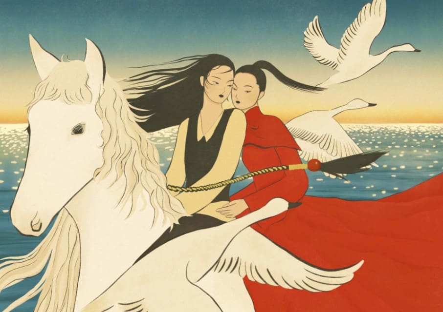
Subtle Hues and Papery Textures Create Intimate Atmospheres in Lea Woo’s Tender Illustrations

Image © Lea Woo

Lea Woo coaxes subtle polarities from her illustrated interactions. Centering on women in moments of quiet affection and admiration, the renderings contrast a vintage style with modern subjects and a largely soft color palette with spots of bolder hues. “Red, a frequently used tone in my works, represents bravery and boldness and green a close relationship with mother nature,” she shares. Grainy, paper-like textures add to the retro feel of the scenes, which convey a warm tenderness between people and the birds, fish, and cats around them.

Based between Shanghai and Hangzhou, Woo draws stark distinctions between her personal works and commissions—recent collaborators include Burberry and The New Yorker.

Read the original article here… and return to discuss on artistvenu below